


The Challenge
Turning a passive balance into active motivation.
How might we design a banking experience that makes saving feel rewarding, visible, and achievable?
Designing around psychology, not just finance. The interface needed to turn every small deposit into visible momentum.
Before and After
From balance-checking to goal-building.


The Solution
Making saving feel like building something.
Progress as the primary interface
The home screen leads with savings goals: progress rings, total saved with a trend indicator, and your saving streak. Balance and transactions are one tap away, but not the default view.

Goals that feel personal
Users create named goals tied to things that matter. Each has a target, timeline, progress indicator, and suggested weekly amount. Setup takes under 30 seconds.


Saving mechanics that remove friction
Three ways to save without thinking about it: Automated rules round-ups, weekly amounts, percentage transfers. Quick Save, one-tap with a satisfying progress animation. Smart suggestions, gentle nudges based on spending patterns.

Design Decisions
Why it looks the way it does? Every visual choice ties back to behavior. The goal was to make saving feel natural, not like a chore.
Savings is the hero, not the balance
Most finance apps open with a current account balance, which tells users what they have. iBank opens with Total Saved, which tells users what they have built. This small shift reframes how people relate to their money from the first second.

Color tells you status before you read
Green means on track. Orange means action needed. Purple means this is the primary thing to do. The system works across Goals, Insights, and the home screen. Users understand where they stand at a glance, without reading a single word.

Goals have a deadline, a pace, and a verdict
Each goal shows a name, a target date, a progress bar, an amount and percentage, and a one-line verdict. "You're on track" or "Behind target, add 200€." This removes ambiguity. Users never have to calculate whether they are doing well.

Financial health as a score, not a report
Spending categories show real amounts, not just percentages. Users instantly see where their money went and how much. The warning icon on Shopping connects directly to the budget alert at the top of the screen, so the problem and its source are always visible together

Scalable System
iBank launched with two core modules. The architecture was designed so that Budgeting, Investing, and Debt Management can plug in without rebuilding the foundation.
Savings and Goals
Users set named goals with deadlines, track progress, and save manually or via Quick Save. Every session starts with total saved front and center.
- Total saved dashboard
- Named goals with deadlines
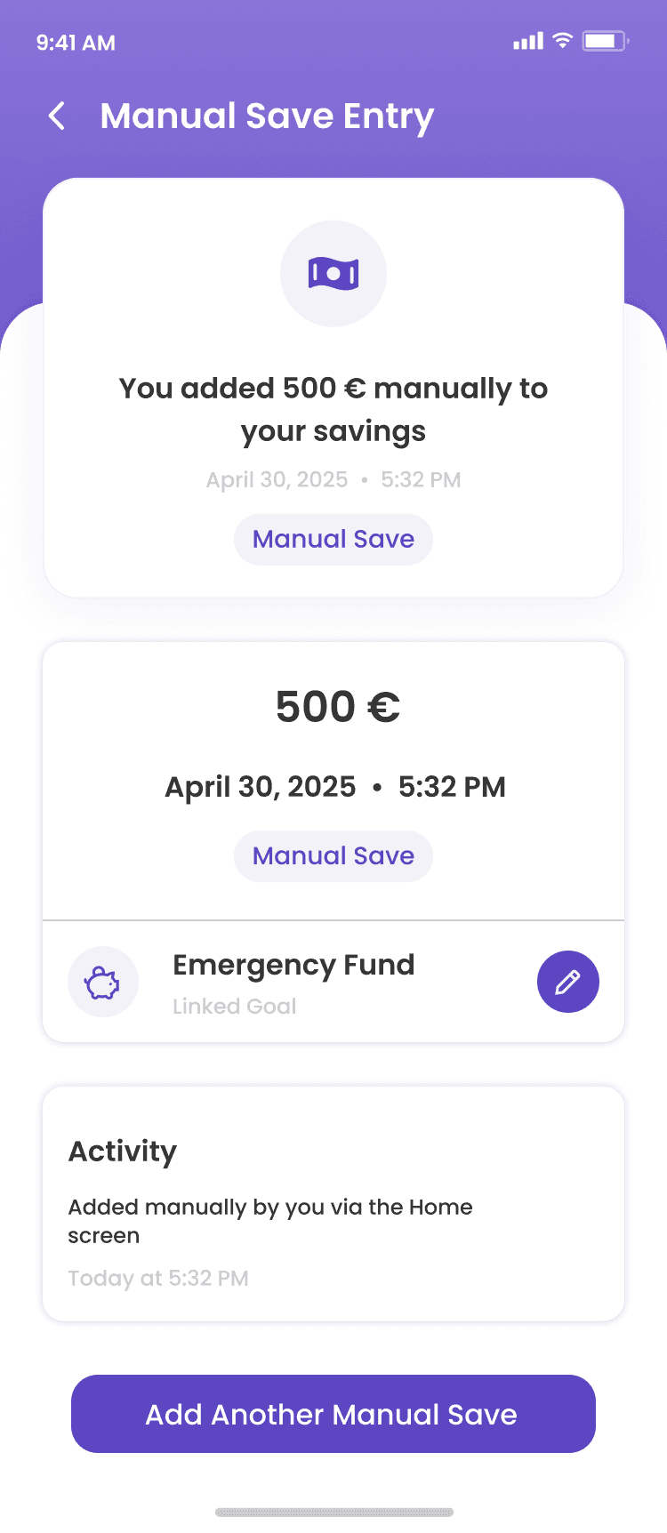
- Manual save entry and history
- On track and behind target alerts
- Quick Save from home screen
Financial Insights
Turns transactions into a Financial Health score, category spending breakdown, and monthly savings summary. Actionable alerts surface problems before they grow.
- Financial Health score (0–100)
- Spending, Savings and Subscription bars
- Budget proximity alerts at the top
- Monthly spending by category
- Full income and expense transaction list
The foundation is intentionally simple. As the product grows, new modules like Budgeting or Investing can plug into the same structure without disrupting what already works.
Reflections
What I learned, what I'd explore next.
What this project taught me
Behavior design is interface design.
Understanding how habits form shaped every decision.
The default screen is a values statement.
Leading with goals communicates a different relationship with money.
Small interactions carry emotional weight.
Progress animations, celebrations, streaks — together they make users return.
What I'd explore next
- User testing to validate progress visualization impact
- Social saving — shared goals, community challenges
- Notification tone — encouraging without nagging
- Extending to budgeting, debt repayment, investing

